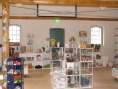
I used the same design universe for the painting as on the Danfoss Universe website. The painting is set up as a single landscape containing three islands symbolizing the continents drifting apart. This complies with the animation on the Danfoss Universe website showing a timeline from right to left where you see the creation of the landscapes with volcanos and a fierce storm, then ice age, then the beginning of vegetation and more calm seismic activity, then the ocean where life arose and finally you see a mechanical digger symbolizing our present civilization.
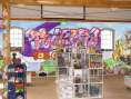
The graffiti letters are "ToolKid - for cool kids" and in the word "cool" you see two small figures instead of the two o's - the same ones you find on the website. The coloring in the two small figures are worked in to the letters above "ToolKid" where red/yellow and blue 'drops' on the letters are colored the same way as the small figures, fire and ice.
There is a coloring behind the graffiti letters associating the Danfoss Universe website background overview. The color transition on the ground layer is the same as the one behind the 'Earth'. However it has been rotated 90 degrees functioning as a horizon.